" height="24px" id="vPkxRrCuI" transform="translate(0.06 0)" width="41.88677911708807px"/></svg>)
Guiding the transition from transactional digital clinic to longevity science leader.
category
Healthcare
services
Strategy
Identity
Website
Campaign
Packaging
year
2024 - Present


Challenge
Healthspan started as a self-funded digital clinic providing longevity-promoting treatments to patients at costs far below that of concierge care. But as big budget, VC-backed start-ups began moving into the space, Healthspan needed to evolve beyond product-based sales and build a trusted brand for the long term. They wanted to look and sound more like the scientific experts they were, design a robust new website with room to grow, and turn unreliable, price-driven shoppers into members of a well-informed, well-cared-for community.
Challenge
Healthspan started as a self-funded digital clinic providing longevity-promoting treatments to patients at costs far below that of concierge care. But as big budget, VC-backed start-ups began moving into the space, Healthspan needed to evolve beyond product-based sales and build a trusted brand for the long term. They wanted to look and sound more like the scientific experts they were, design a robust new website with room to grow, and turn unreliable, price-driven shoppers into members of a well-informed, well-cared-for community.



Strategy
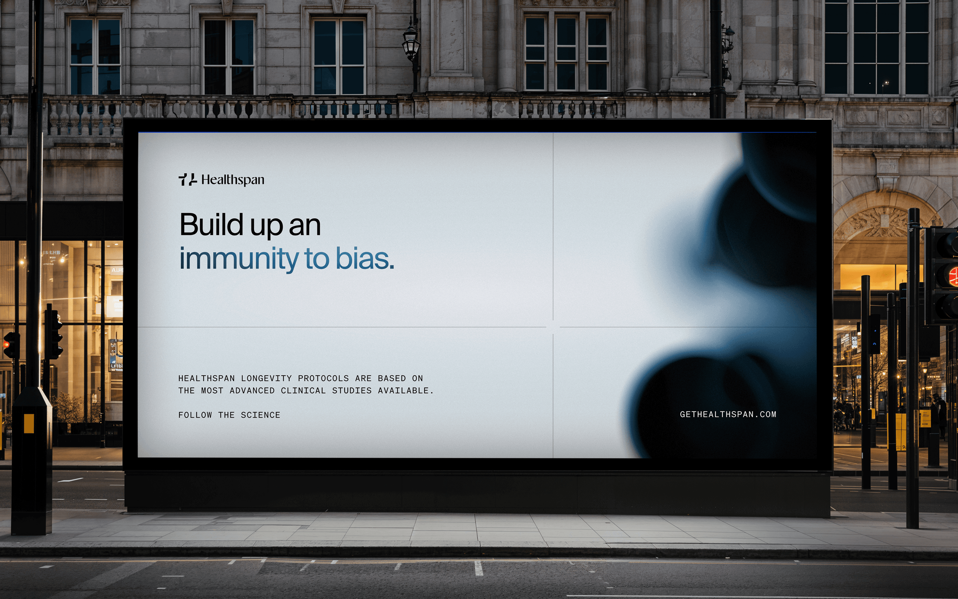
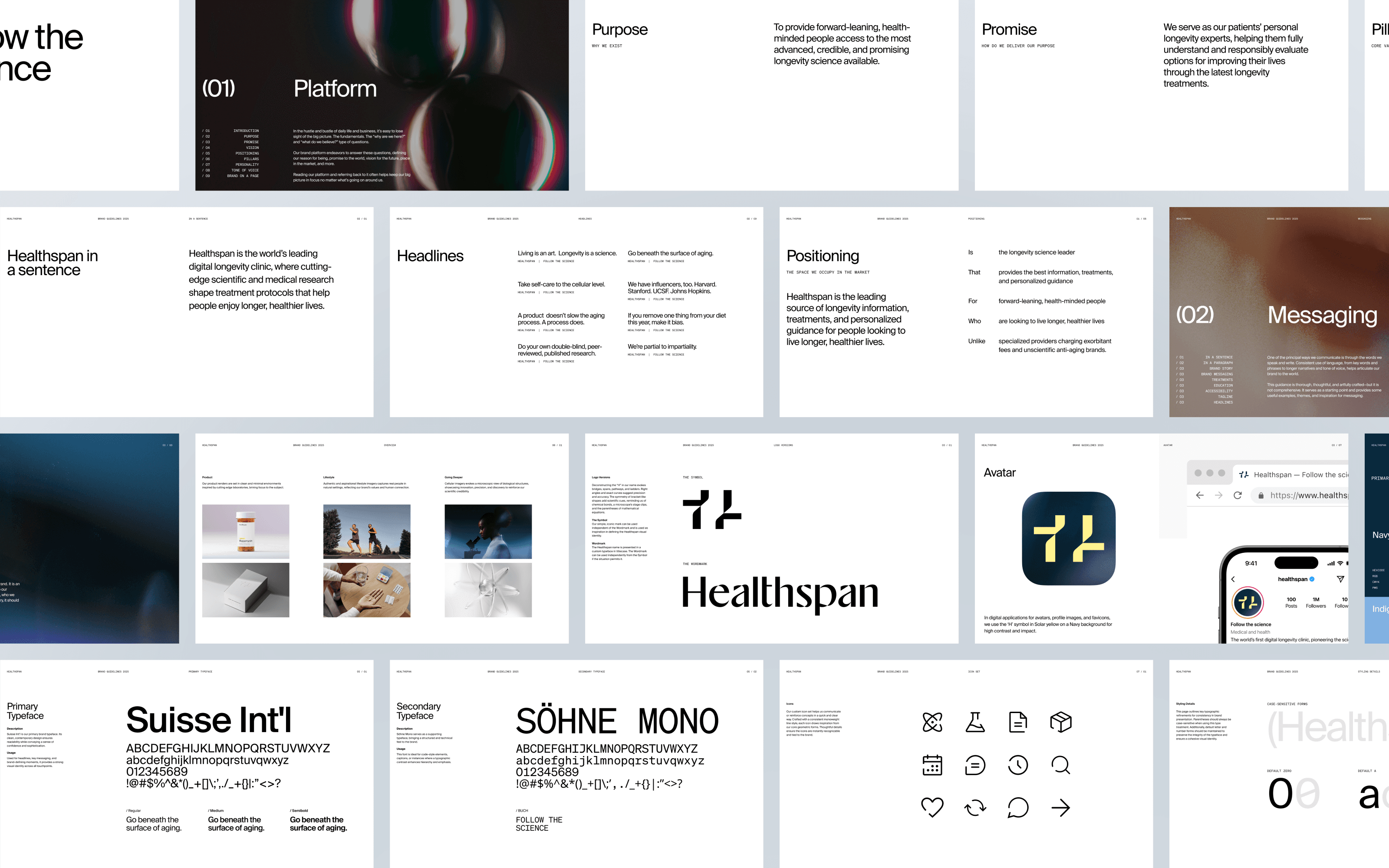
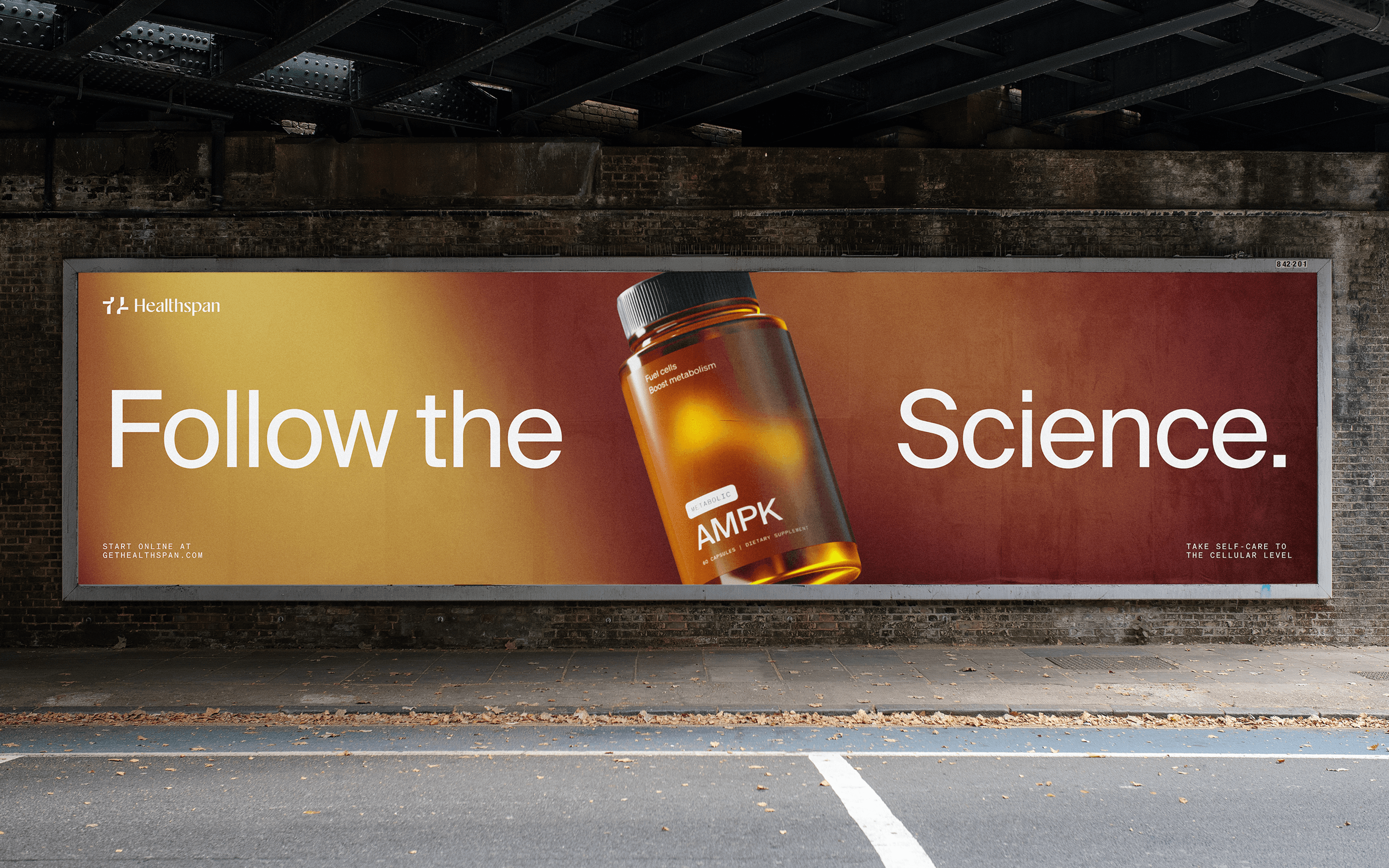
We took Healthspan back to its roots, first focusing on the brand identity, messaging, and other platform components before tackling the website and marketing needs. It was an eye-opening process for all involved that led to a clear consensus: Healthspan was being defined by its products when its heart was in its process. “Follow the science” became our manta for their mission, speaking to high quality standards, high information levels, and high-IQ patients.
Strategy
We took Healthspan back to its roots, first focusing on the brand identity, messaging, and other platform components before tackling the website and marketing needs. It was an eye-opening process for all involved that led to a clear consensus: Healthspan was being defined by its products when its heart was in its process. “Follow the science” became our manta for their mission, speaking to high quality standards, high information levels, and high-IQ patients.




Identity
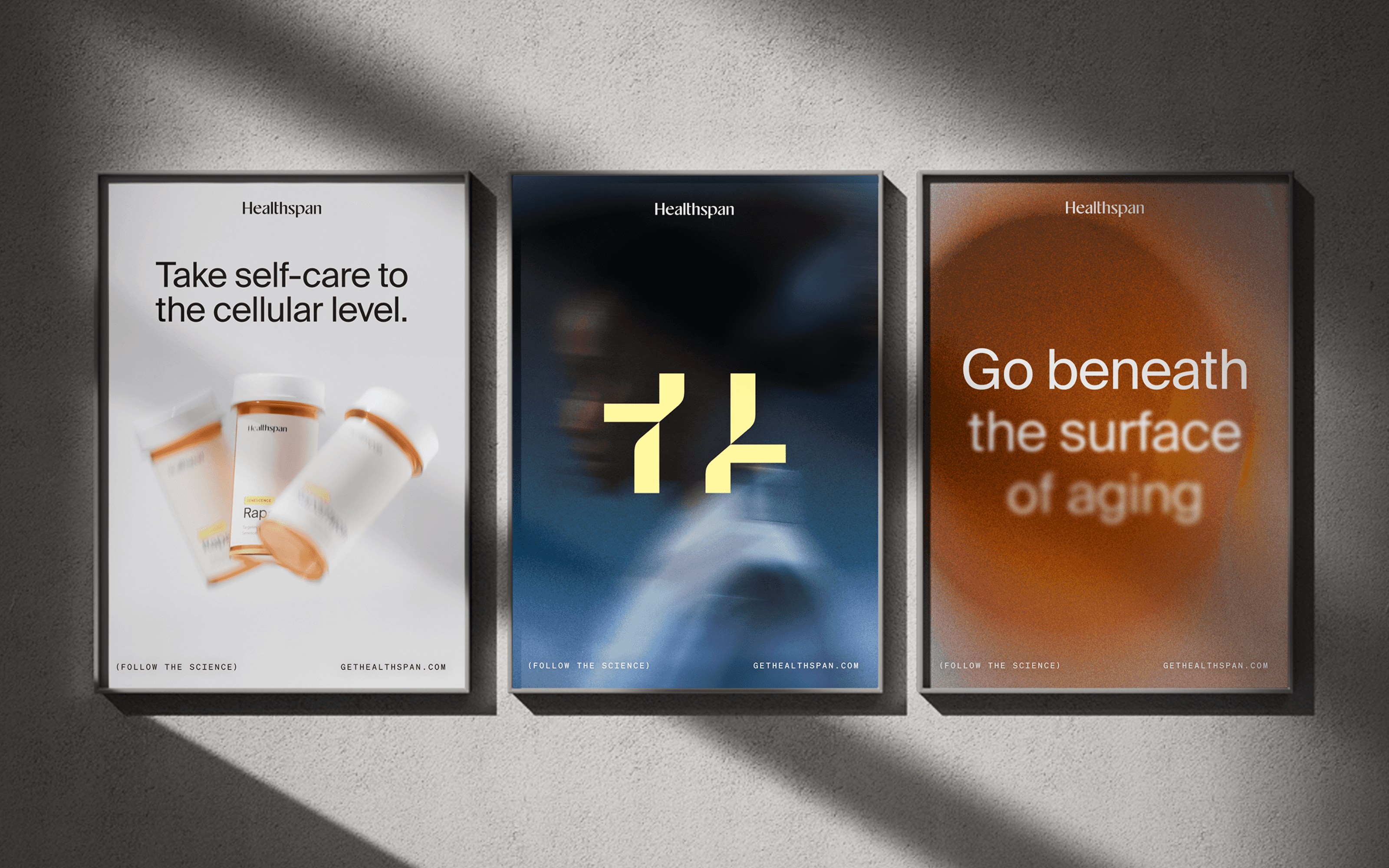
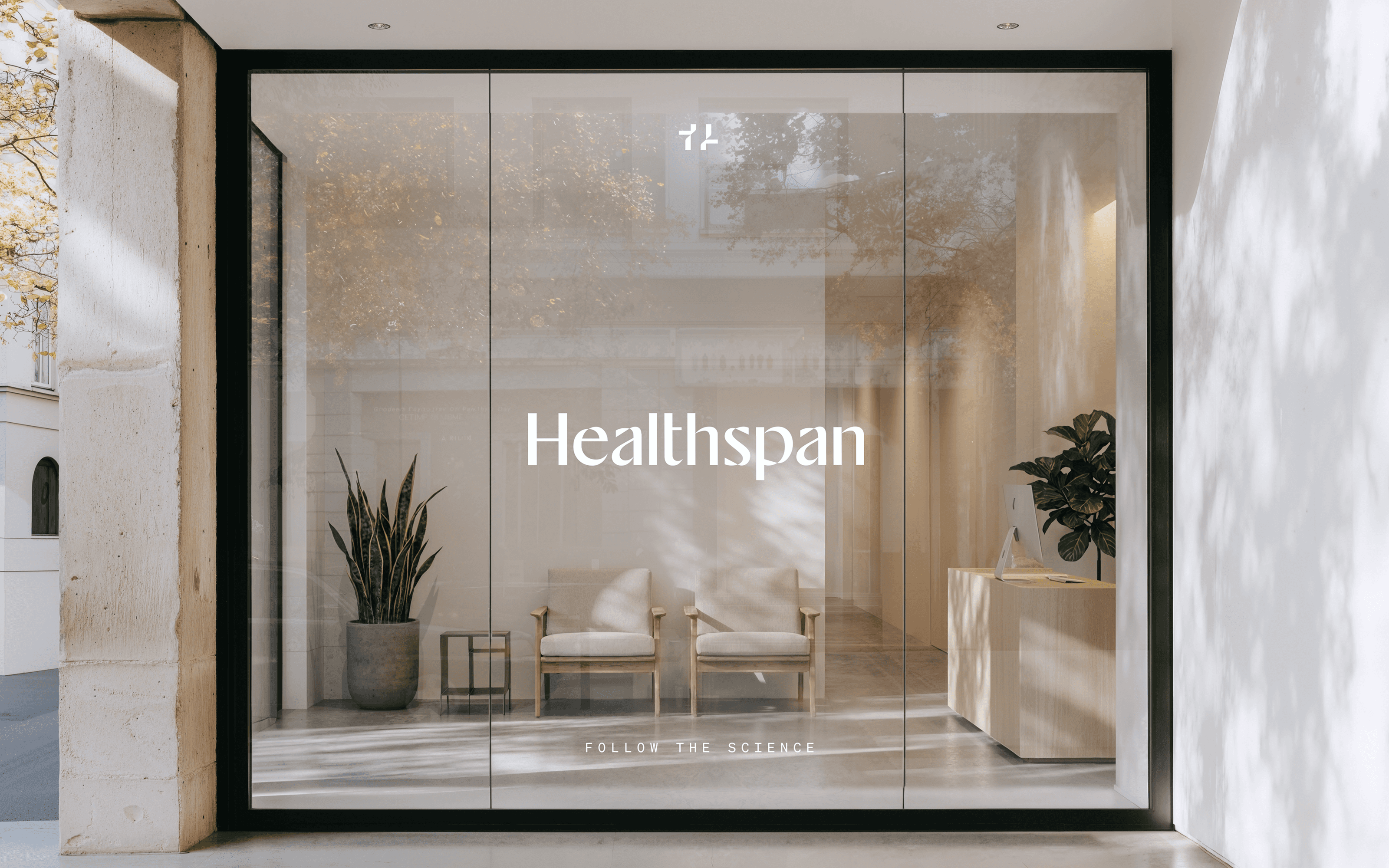
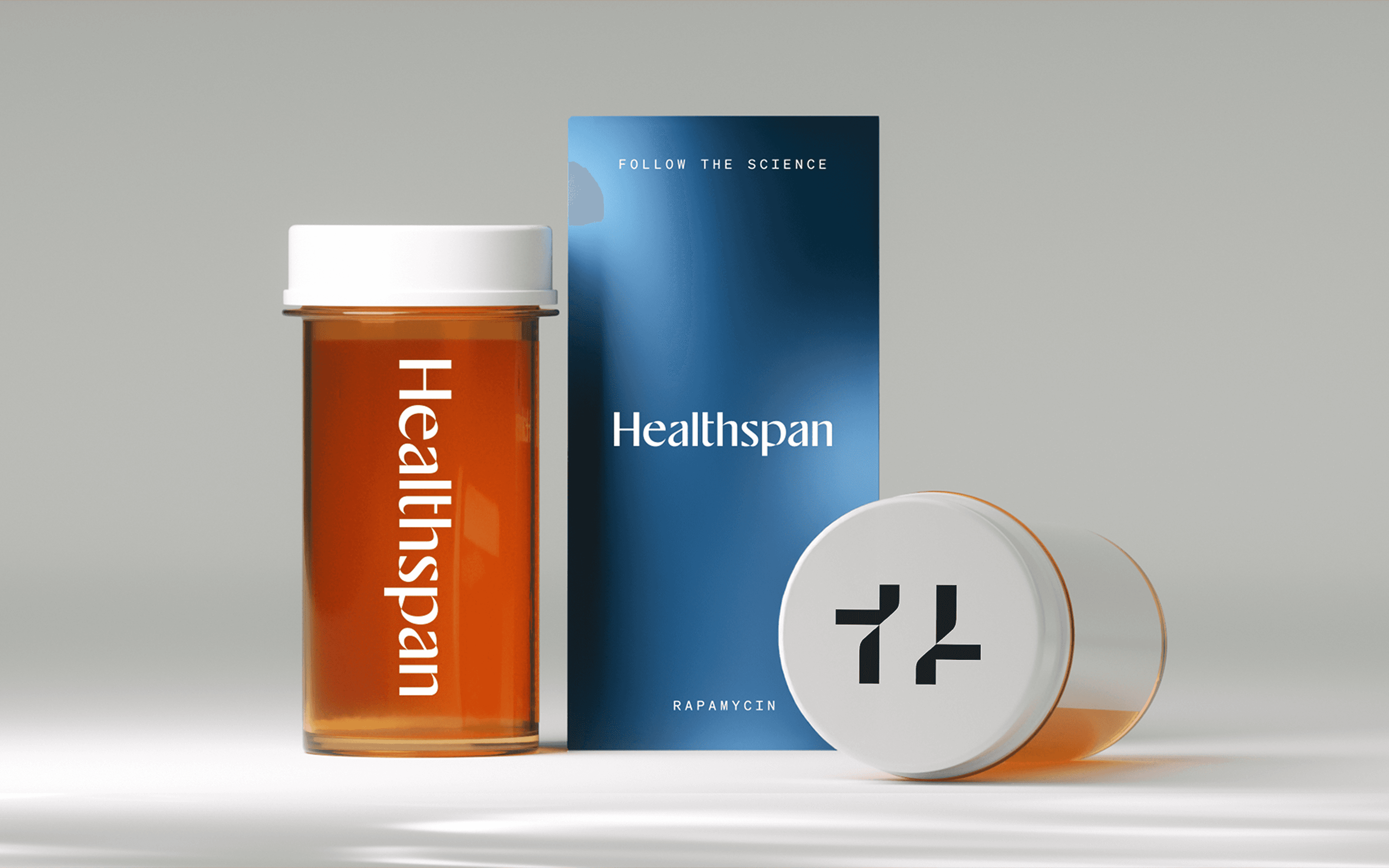
The goal for the logo was to elevate the brand, making it feel premium and authoritative, while tying back to the laboratory. Our solution began with a custom word mark that was legible, clean, and “cutting edge,” while also feeling original, advanced, and modern. The symbol we designed to complete the logo set contains nods to the parentheses of scientific literature, the stage clips of a microscope, and of course the capital “H” of Healthspan.
Identity
The goal for the logo was to elevate the brand, making it feel premium and authoritative, while tying back to the laboratory. Our solution began with a custom word mark that was legible, clean, and “cutting edge,” while also feeling original, advanced, and modern. The symbol we designed to complete the logo set contains nods to the parentheses of scientific literature, the stage clips of a microscope, and of course the capital “H” of Healthspan.


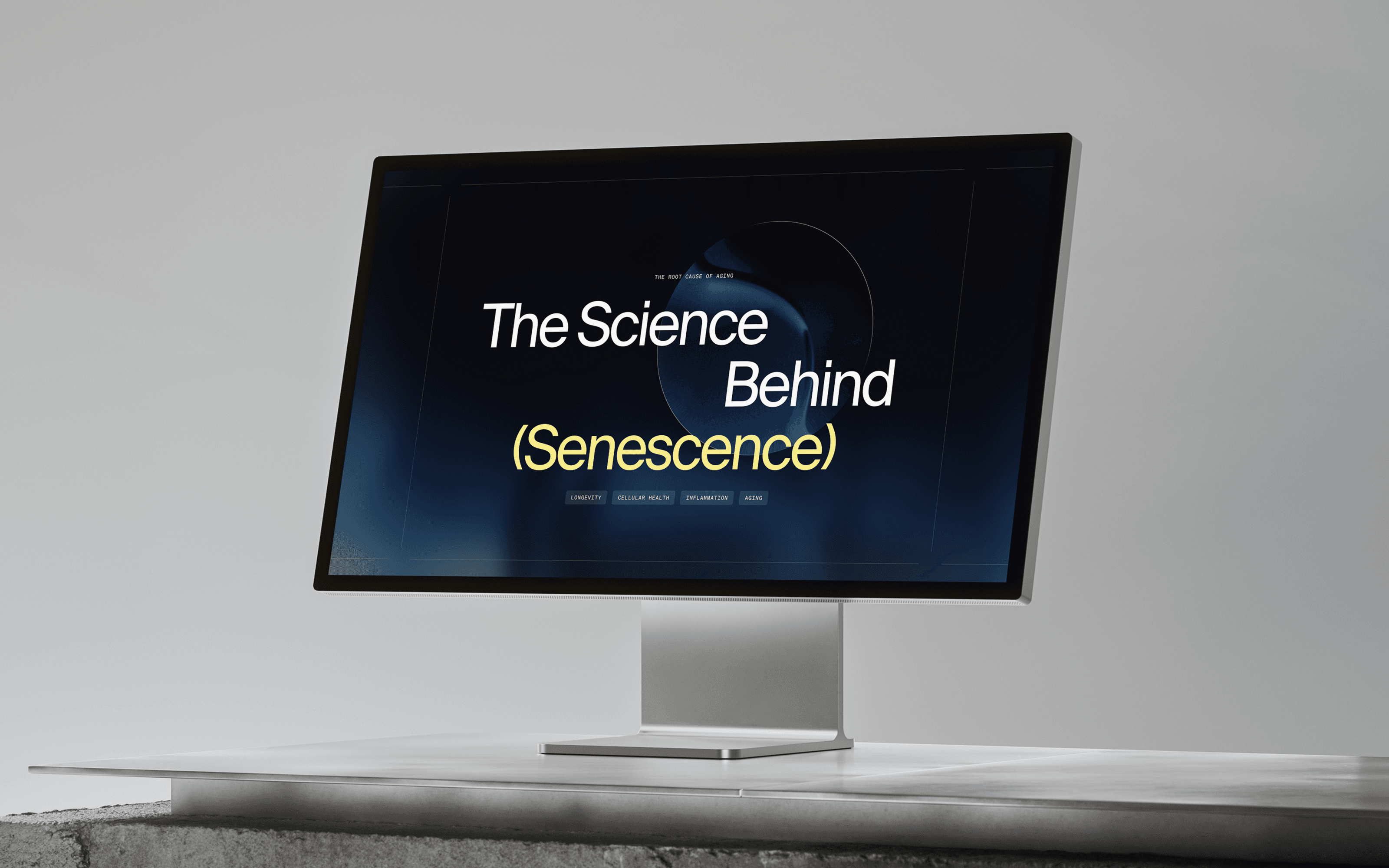
Website
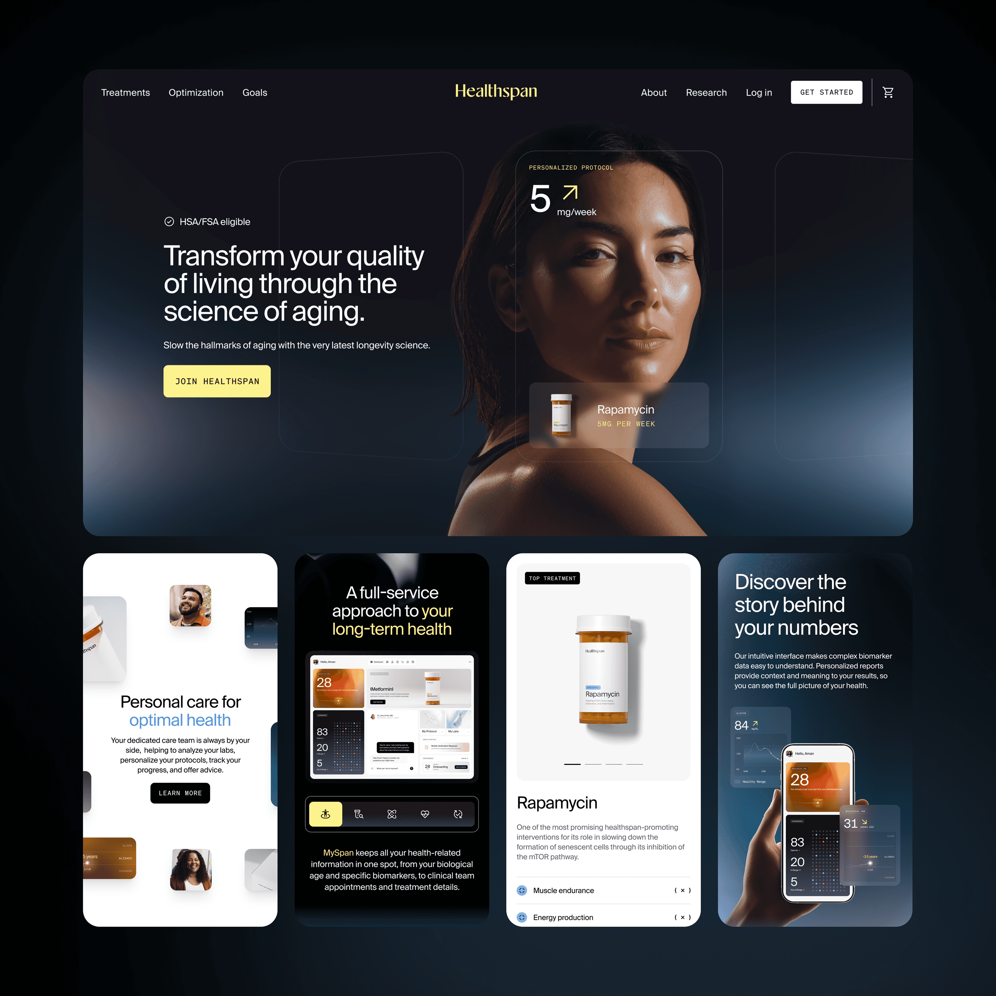
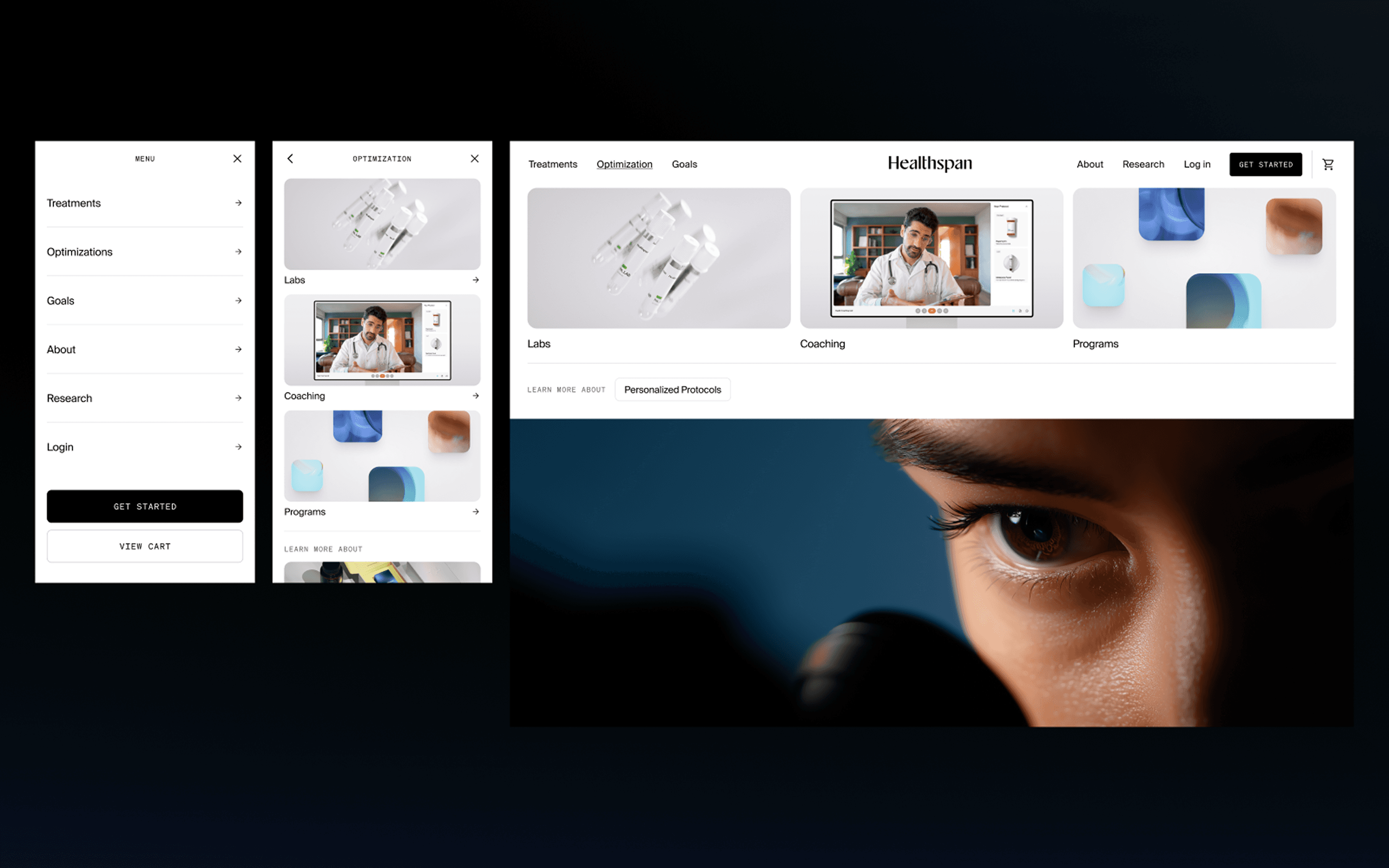
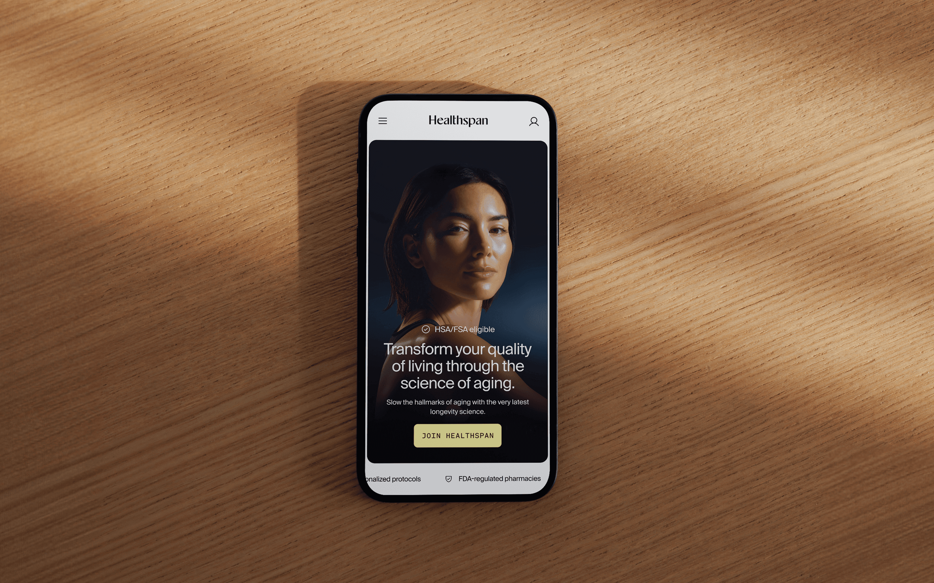
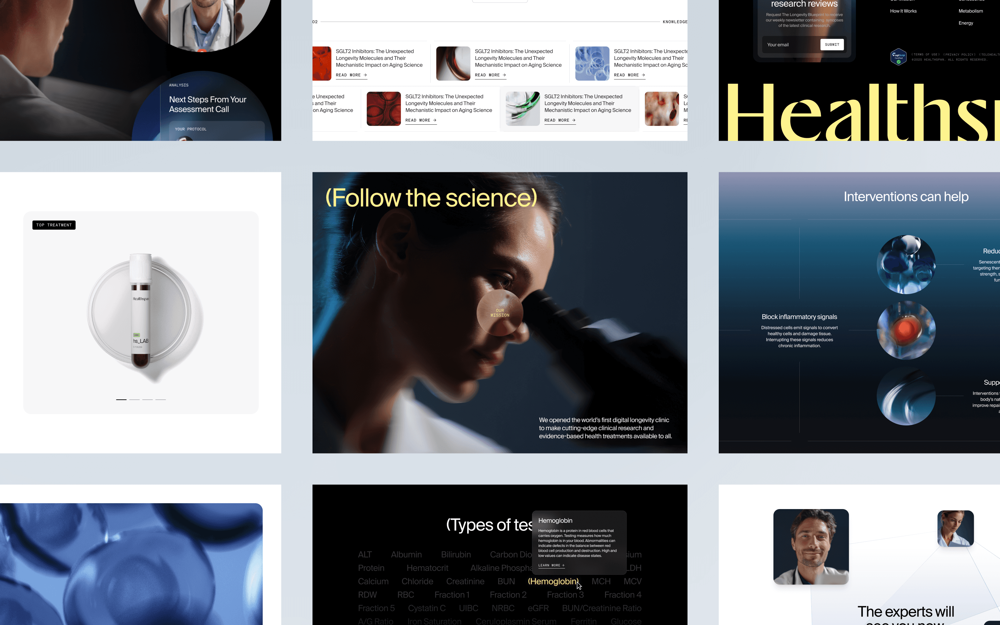
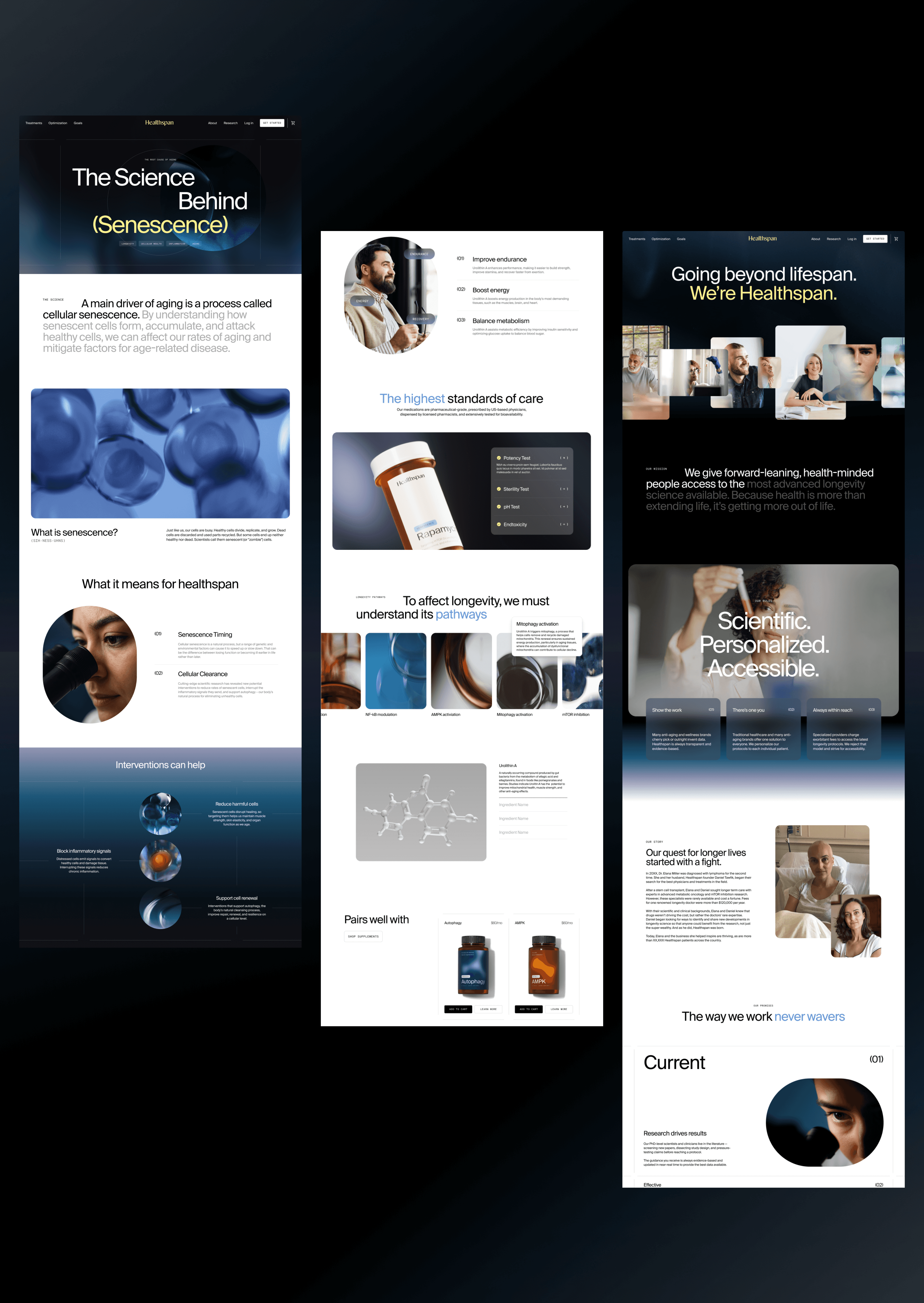
Reimagining gethealthspan.com was a massive undertaking, requiring a delicate balance of e-comm best practices and big brand storytelling. We knew that many users would arrive to the site not at the home page, but via ads to product pages. Site architecture needed to be flexible to accommodate future offerings. And while membership was the key to long-term success, discouraging a la carte purchases was not an option. Extensive planning in the IA and UX stages set the project up for success and it was satisfying to see the new brand style come to life on such a hard-working website.
Website
Reimagining gethealthspan.com was a massive undertaking, requiring a delicate balance of e-comm best practices and big brand storytelling. We knew that many users would arrive to the site not at the home page, but via ads to product pages. Site architecture needed to be flexible to accommodate future offerings. And while membership was the key to long-term success, discouraging a la carte purchases was not an option. Extensive planning in the IA and UX stages set the project up for success and it was satisfying to see the new brand style come to life on such a hard-working website.

Product
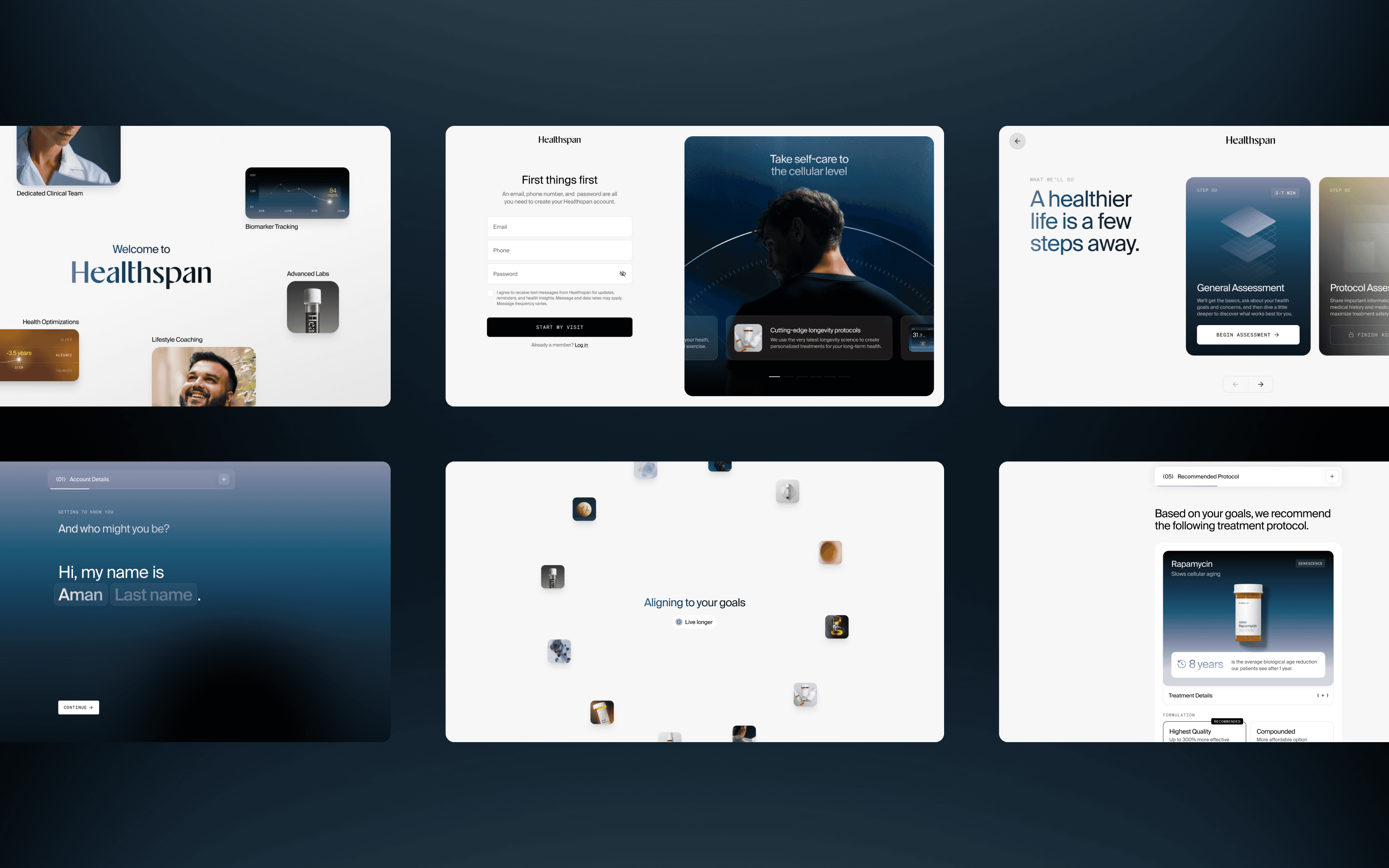
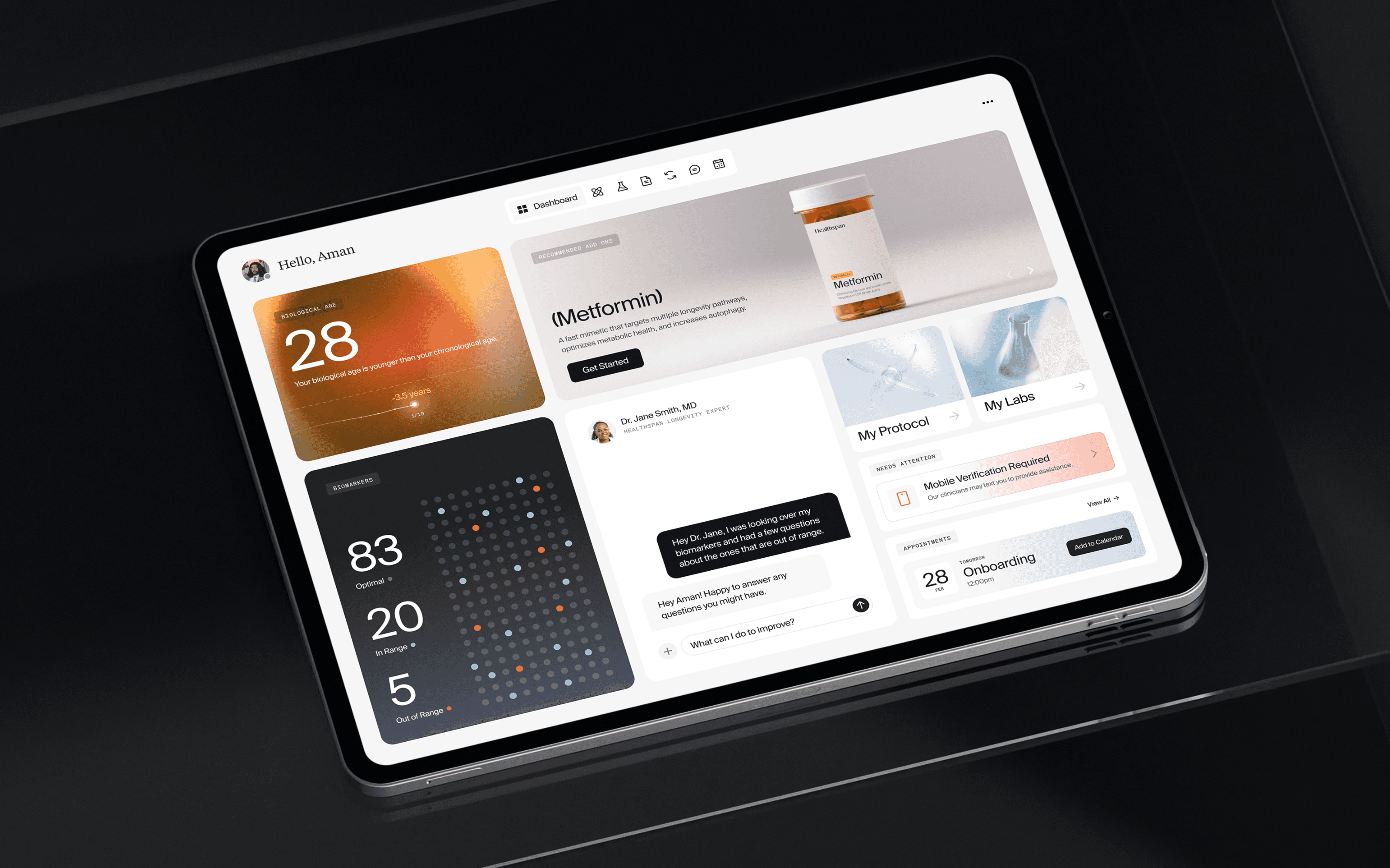
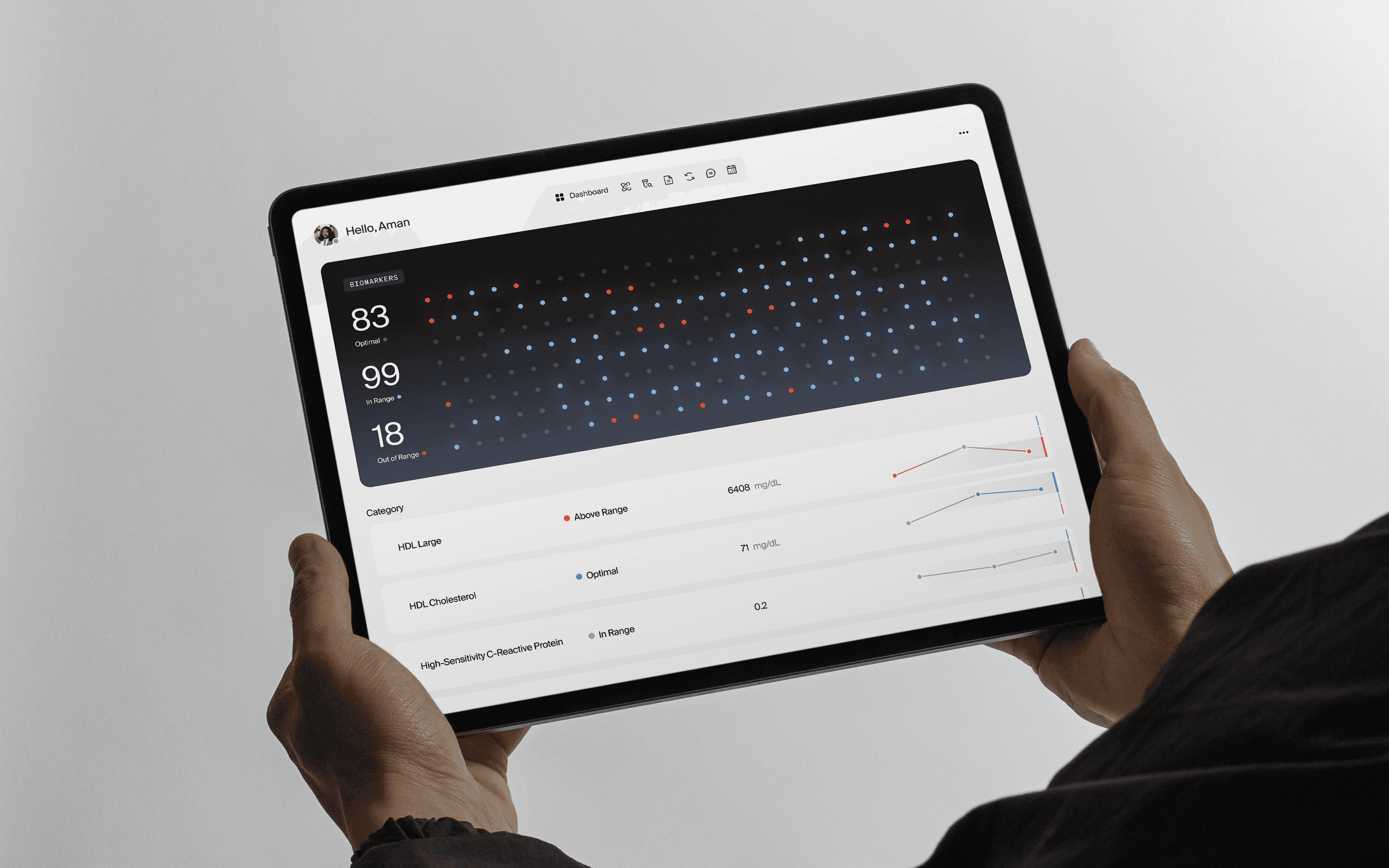
Healthspan’s complex offering was evident in their patient sign-up flow. A long list of medical questions and care options, along with “sticker shock” once purchases were tallied, prompted many users to quit before checking out. We were tasked with telling a more compelling and cohesive story — a story that conveyed the value of the offering through seven possible entry points in a choose-your-own-adventure style flow. That required re-mapping and re-writing the workflow — using color, language, navigation, and more — to plot a path users could enjoy all the way to its end.
Product
Healthspan’s complex offering was evident in their patient sign-up flow. A long list of medical questions and care options, along with “sticker shock” once purchases were tallied, prompted many users to quit before checking out. We were tasked with telling a more compelling and cohesive story — a story that conveyed the value of the offering through seven possible entry points in a choose-your-own-adventure style flow. That required re-mapping and re-writing the workflow — using color, language, navigation, and more — to plot a path users could enjoy all the way to its end.

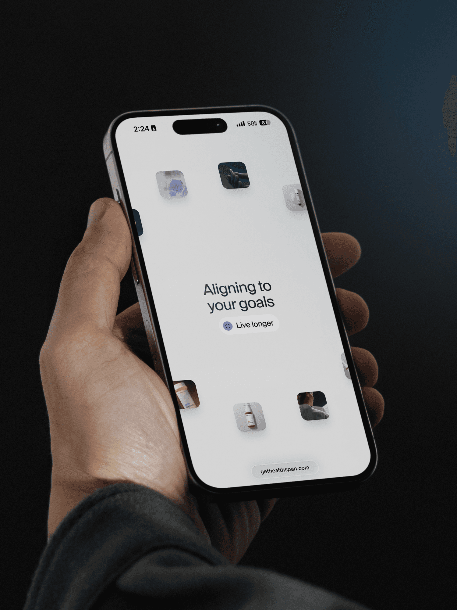
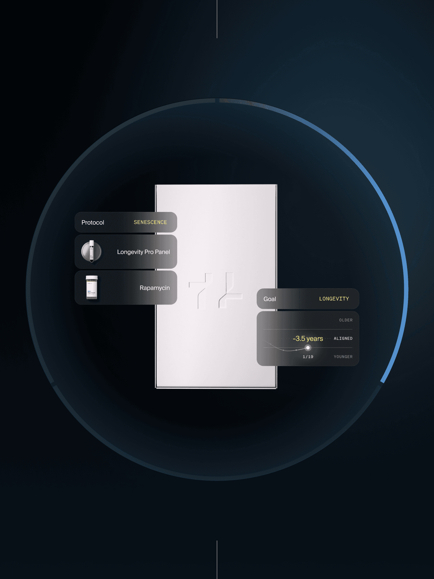
Packaging
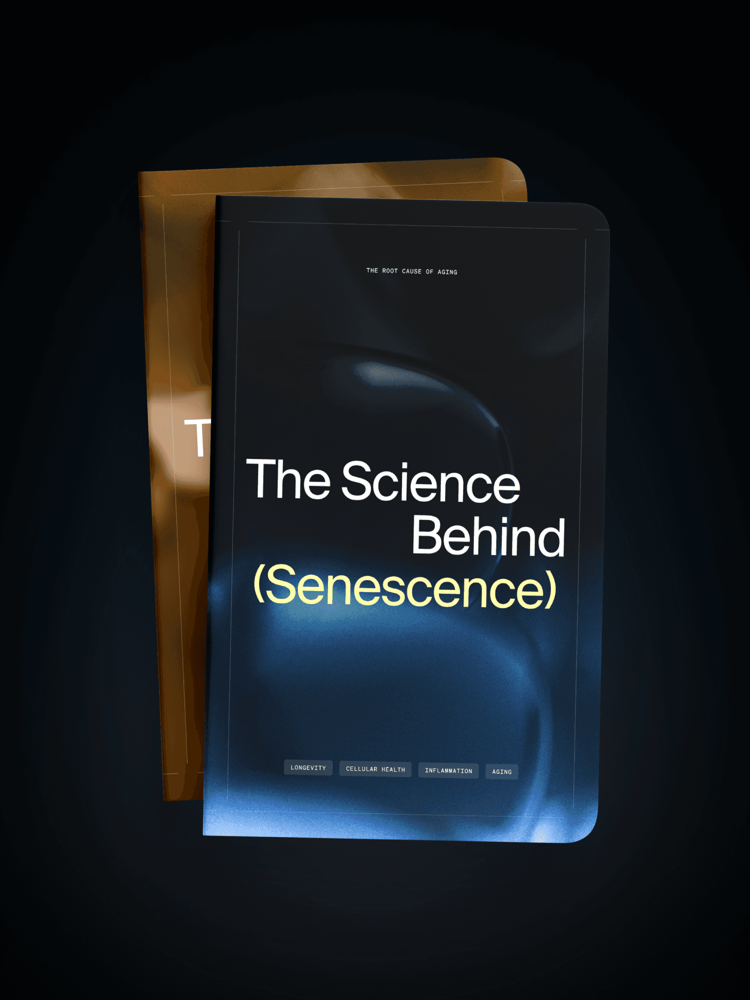
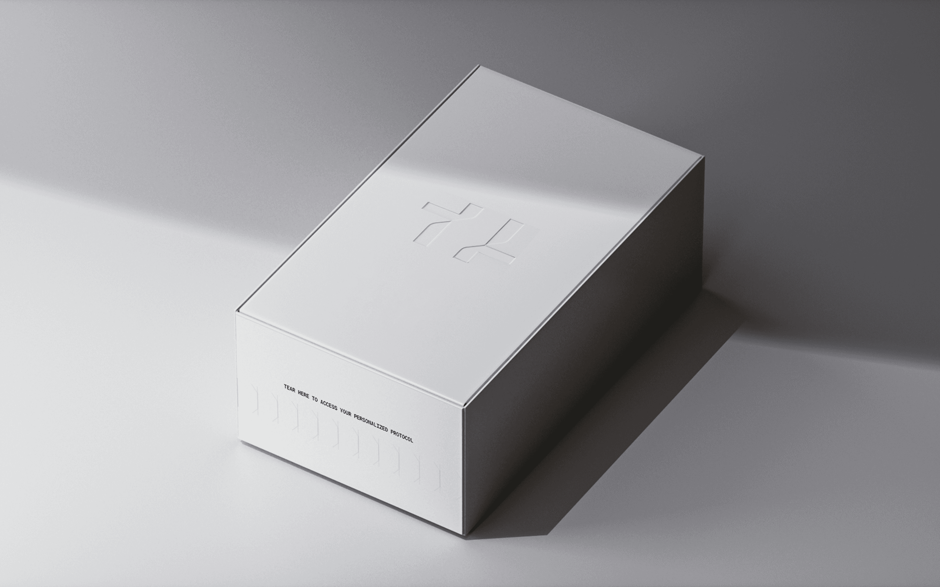
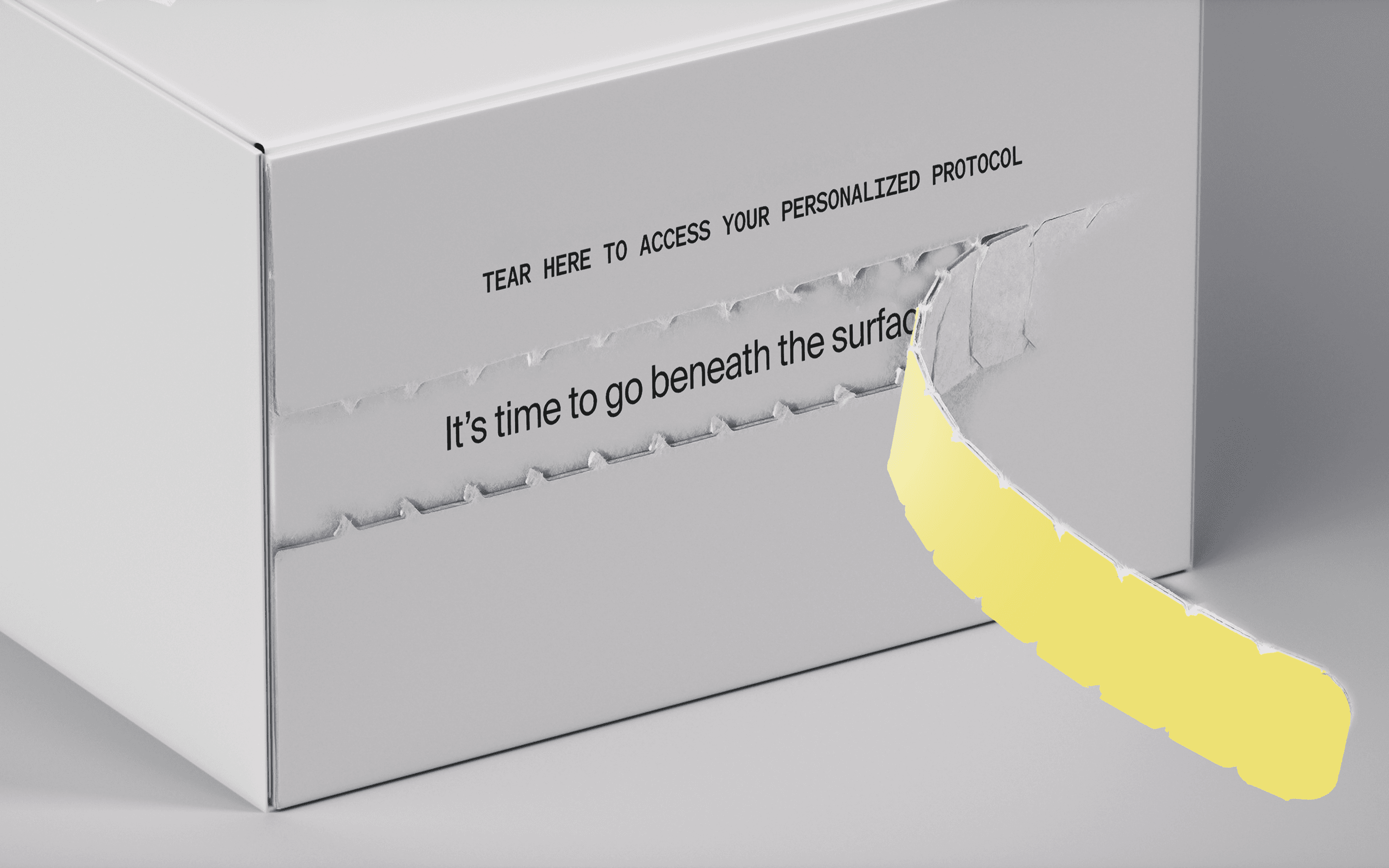
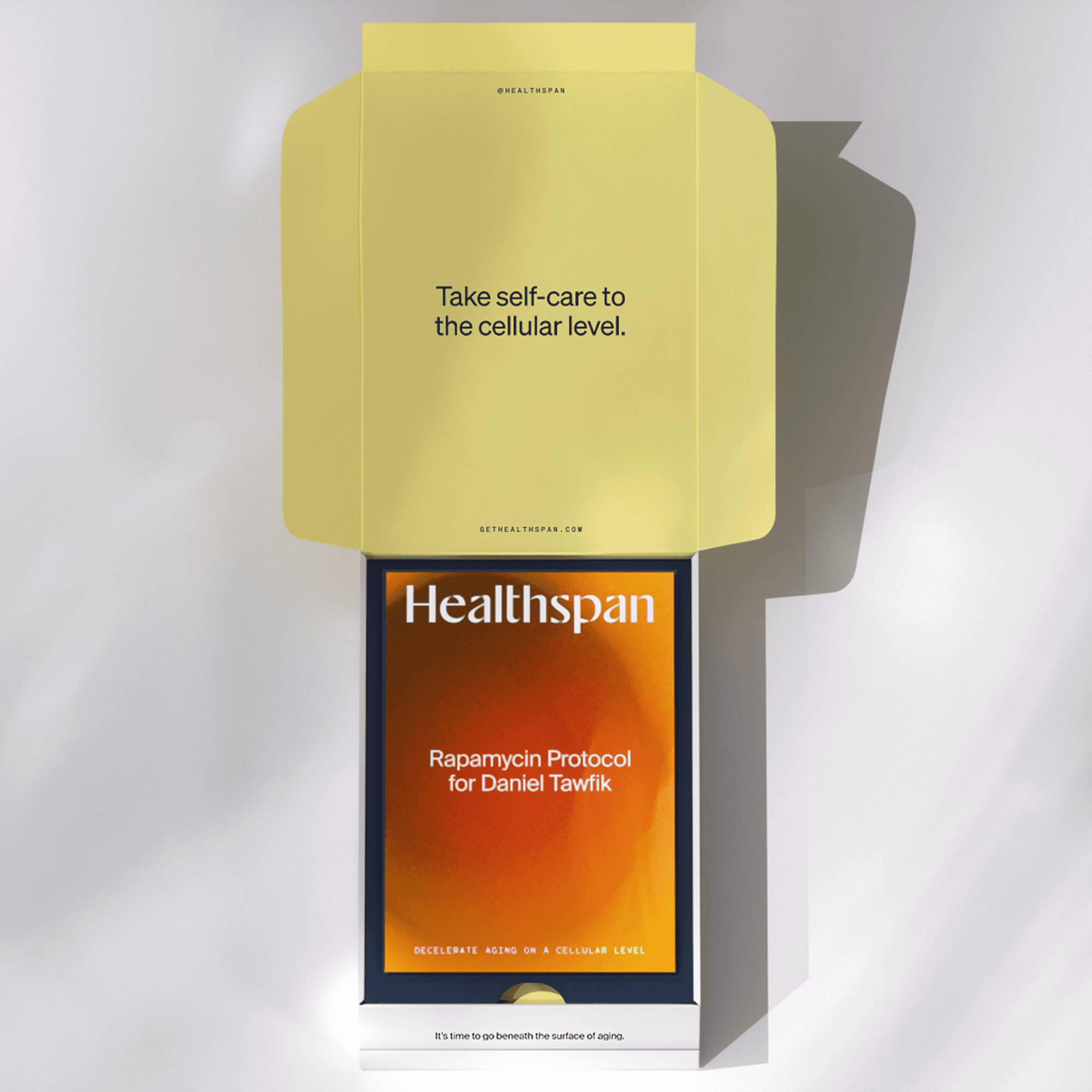
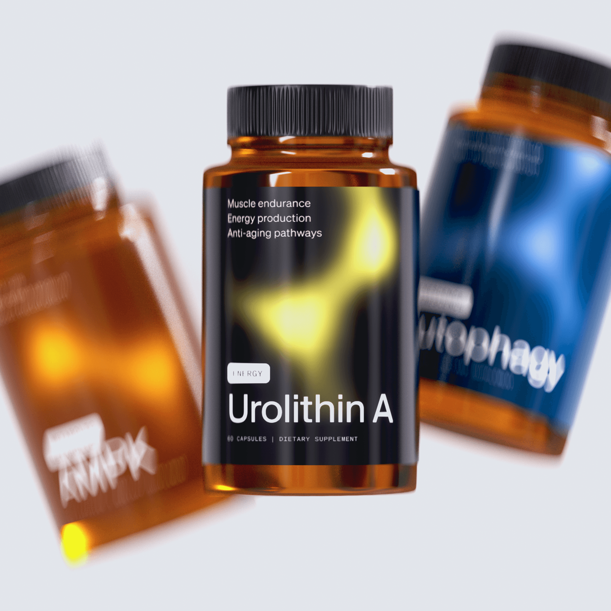
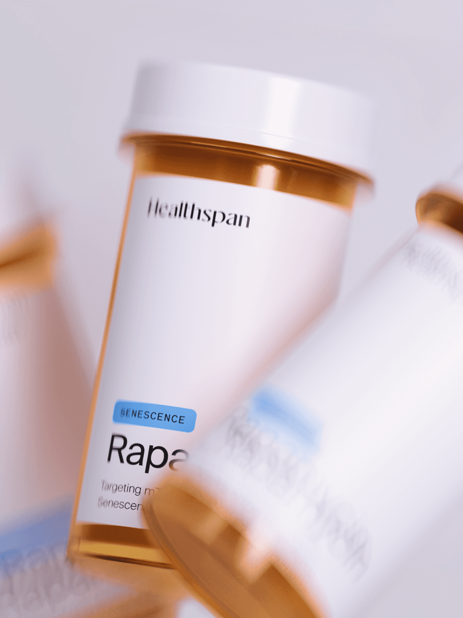
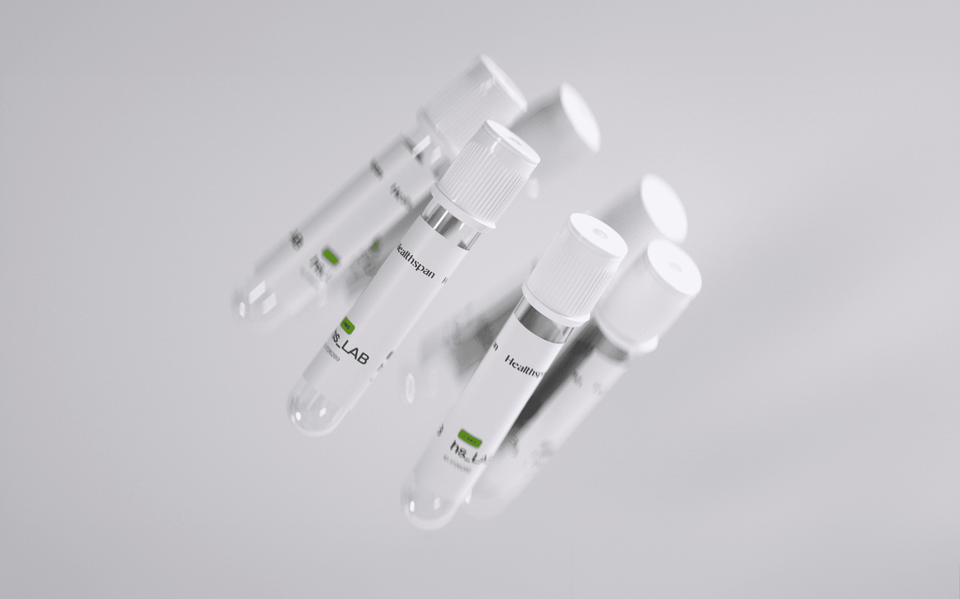
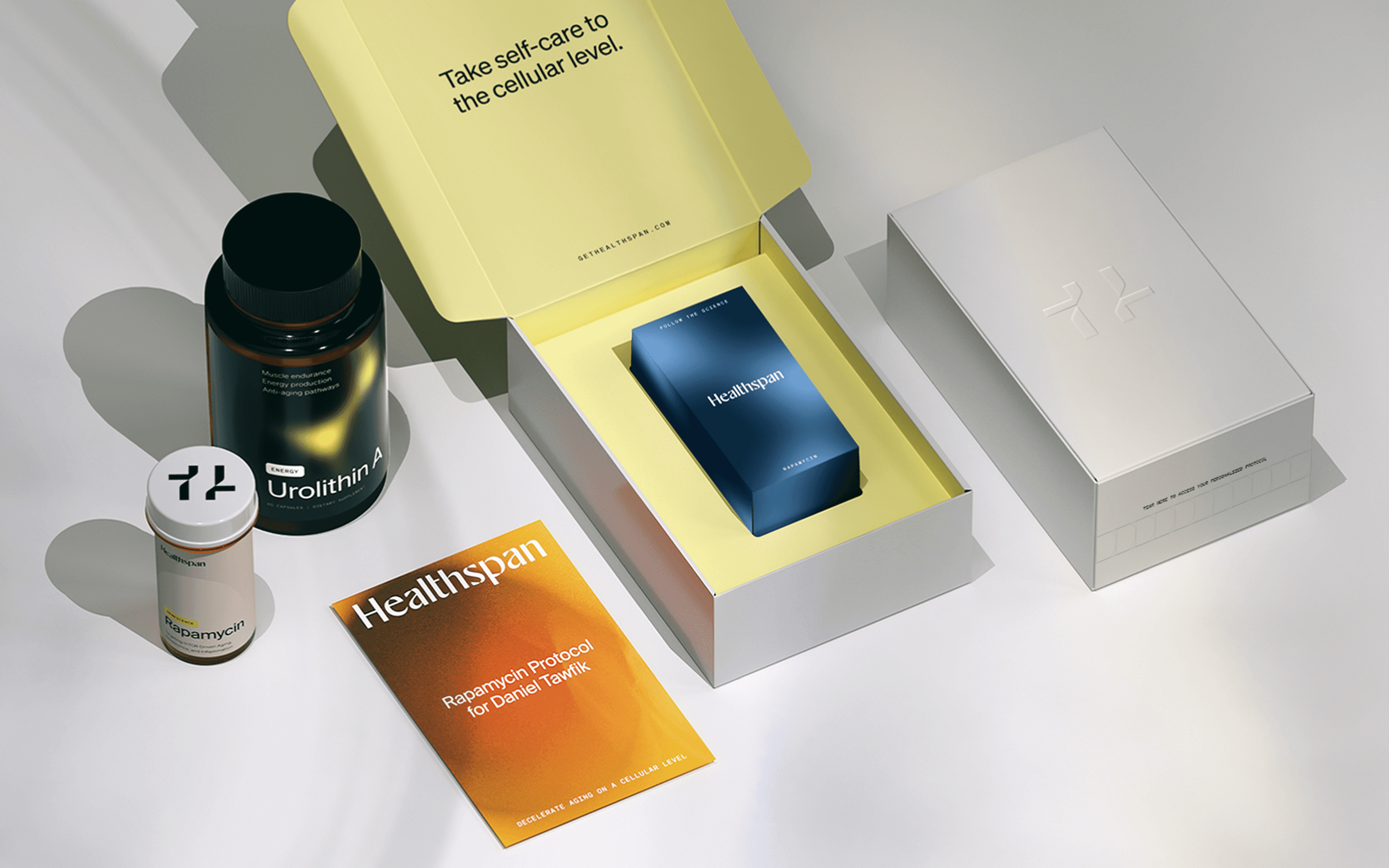
Healthspan had varying levels of control over its packaging. Prescription medications follow tight regulations, whereas supplements and exterior boxes are easier to affect. We viewed an order arriving at a patient’s door as a significant moment for the brand. So, we designed sleek and sophisticated packages that conveyed the scientific and personal nature of the products with pops of color and “surprise and delight” elements that made customers look forward to each unboxing.
Packaging
Healthspan had varying levels of control over its packaging. Prescription medications follow tight regulations, whereas supplements and exterior boxes are easier to affect. We viewed an order arriving at a patient’s door as a significant moment for the brand. So, we designed sleek and sophisticated packages that conveyed the scientific and personal nature of the products with pops of color and “surprise and delight” elements that made customers look forward to each unboxing.

Working with Azyy has been transformational for Healthspan. Over the course of countless interviews, their team methodically and creatively distilled our brand into something far more cohesive and compelling than we imagined possible. I found myself genuinely looking forward to our weekly meetings, eager to see what they’d come up with next, their creative output consistently exceeded expectations.
Having worked with many creative studios over the years, I can say without hesitation that Azyy stands orders of magnitude above the rest. Their work has redefined for me what truly exceptional creative collaboration looks like, and it’s been one of the most valuable investments we’ve made as a company. We will always be a client of Azyy’s.
Daniel Tawfik
ceo — healthspan
Outcome
In just a year and a half with us, Healthspan was able to unveil a new brand platform, identity, robust website, and sign-up flow. The speedy transformation so impressed the client team that our relationship was expanded to include social media creative as well. And for the work’s effect on customers, Healthspan saw a revenue increase of 5% per month for the first quarter of 2026, for a total of 15% and counting.
Outcome
In just a year and a half with us, Healthspan was able to unveil a new brand platform, identity, robust website, and sign-up flow. The speedy transformation so impressed the client team that our relationship was expanded to include social media creative as well. And for the work’s effect on customers, Healthspan saw a revenue increase of 5% per month for the first quarter of 2026, for a total of 15% and counting.